
5 posts tagged with "Icon Map Pro"

View All Tags

Telecoms - Display Cell Tower KPIs in Icon Map Pro

· 6 min read
James Dales
Co-founder of Tekantis

A common use case for our telecoms customers is to show cell tower locations, using wedge diagrams, to represent various information and KPIs. This blog shows a repeatable approach for achieving this using Icon Map Pro.

Icon Map Pro showing cell tower KPIs as wedges

Consider our source data:

SiteIDCellIDLatitudeLongitudeAzimuthBeamwidthThroughput
SITE_1CELL_1_251.5104471707975-0.14339976206510
SITE_1CELL_1_251.5104471707975-0.143399762906510
SITE_1CELL_1_351.5104471707975-0.143399762180906
SITE_1CELL_1_451.5104471707975-0.143399762270906
SITE_2CELL_2_151.519405119581-0.11369152904510
SITE_2CELL_2_251.519405119581-0.113691529909010
SITE_2CELL_2_351.519405119581-0.113691529180456
SITE_2CELL_2_451.519405119581-0.113691529270456
SITE_3CELL_3_151.5178896481135-0.14733269306010
SITE_3CELL_3_251.5178896481135-0.147332693906010
SITE_3CELL_3_351.5178896481135-0.147332693180906
SITE_3CELL_3_451.5178896481135-0.147332693270906
SITE_4CELL_4_151.5086784040137-0.13254363906510
SITE_4CELL_4_251.5086784040137-0.132543639180656
SITE_5CELL_5_151.5072231988425-0.14059565906010
SITE_5CELL_5_251.5072231988425-0.1405956591204510
SITE_5CELL_5_351.5072231988425-0.140595659240656
SITE_6CELL_6_151.5161939797486-0.1261331270906
SITE_6CELL_6_251.5161939797486-0.126133127120606
SITE_6CELL_6_351.5161939797486-0.126133127240906

We have 6 sites, each with a number of sectors (cells), located using latitude and longitude. Each sector has its azimuth (the central pointing direction of the antenna, measured clockwise from true north) and its beamwidth (the angular width of the main lobe). We also include the current throughput KPI for each cell. We’re going to use this throughput value to drive the wedge coloring.

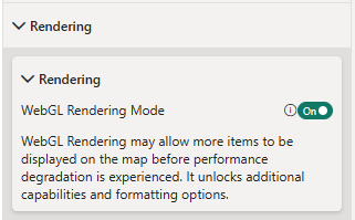
To show the wedge symbols for each site, we're going to construct an SVG for each location. This is a great opportunity to use a new feature in Power BI - DAX User Defined Functions (UDFs). However, at the time of writing, this is a preview feature, so we need to ensure it's enabled in Power BI's preview features settings:

Power BI Preview Features Dialog Showing the Location of the User Defined Functions setting

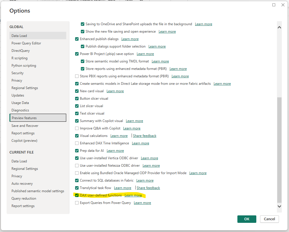
You will need to restart Power BI Desktop after enabling this feature.

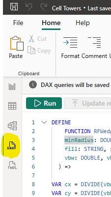
With this enabled, we can now use Power BI's DAX view to paste in our UDFs.

Location of DAX view in Power BI Desktop

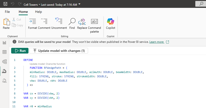
Our main UDF generates a single wedge as an SVG path. We also have a couple of other functions to ensure our SVG is rendered correctly as a data URL to include in the map.

DEFINE
FUNCTION RFWedgePath = (
minRadius: DOUBLE, maxRadius: DOUBLE, azimuth: DOUBLE, beamWidth: DOUBLE,
fill: STRING, stroke: STRING, strokeWidth: DOUBLE,
vbw: DOUBLE, vbh: DOUBLE
) =>

VAR cx = DIVIDE(vbw, 2)
VAR cy = DIVIDE(vbh, 2)

VAR r0 = minRadius
VAR r1 = maxRadius

VAR a0 = azimuth - beamWidth / 2
VAR a1 = azimuth + beamWidth / 2

VAR rad0 = RADIANS(a0)
VAR rad1 = RADIANS(a1)

VAR x0o = cx + r1 * COS(rad0)
VAR y0o = cy - r1 * SIN(rad0)
VAR x1o = cx + r1 * COS(rad1)
VAR y1o = cy - r1 * SIN(rad1)

VAR sweep = 0
VAR largeArc = IF( ABS(a1 - a0) > 180, 1, 0 )

VAR dPath =
IF(
r0 <= 0,
"M " & NumText(x0o) & " " & NumText(y0o) &
" A " & NumText(r1) & " " & NumText(r1) & " 0 " & largeArc & " " & sweep & " " &
NumText(x1o) & " " & NumText(y1o) &
" L " & NumText(cx) & " " & NumText(cy) & " Z",
VAR x1i = cx + r0 * COS(rad1)
VAR y1i = cy - r0 * SIN(rad1)
VAR x0i = cx + r0 * COS(rad0)
VAR y0i = cy - r0 * SIN(rad0)
RETURN
"M " & NumText(x0o) & " " & NumText(y0o) &
" A " & NumText(r1) & " " & NumText(r1) & " 0 " & largeArc & " " & sweep & " " &
NumText(x1o) & " " & NumText(y1o) &
" L " & NumText(x1i) & " " & NumText(y1i) &
" A " & NumText(r0) & " " & NumText(r0) & " 0 " & largeArc & " " & (1 - sweep) & " " &
NumText(x0i) & " " & NumText(y0i) & " Z"
)

RETURN
"<path d='" & dPath & "' fill='" & fill & "' stroke='" & stroke &
"' stroke-width='" & NumText(strokeWidth) & "' />"

DEFINE
FUNCTION NumText = (n: DOUBLE) =>
VAR t = FORMAT(n,"0.########")
RETURN IF(RIGHT(t,1)=".", LEFT(t,LEN(t)-1), t)


DEFINE
FUNCTION UrlEncodeSvg = ( raw : STRING ) =>
SUBSTITUTE(
SUBSTITUTE(
SUBSTITUTE(
SUBSTITUTE(
SUBSTITUTE(
SUBSTITUTE(
raw,
" ", "%20"
),
"#", "%23"
),
"""", "%22"
),
"<", "%3C"
),
">", "%3E"
),
"'", "%27"
)

Paste this into the DAX query window and press the "Update model with changes (3)" button.

Screenshot showing the Update model with changes button

We now have a reusable set of functions that we can call from inside a DAX measure.

However, before we generate our tower SVG, we're going to create a quick DAX measure to determine the wedge colors based on the Throughput value.

Add the following measure:

KPI Color = 
VAR t = SELECTEDVALUE('Cells'[Throughput])
RETURN
SWITCH(
TRUE(),
ISBLANK(t), "#BDBDBD", -- no data: grey
t <= 2, "#d73027", -- red
t <= 4, "#fc8d59",
t <= 6, "#fee08b",
t <= 8, "#d9ef8b",
t <= 10, "#91cf60",
"#1a9850" -- >10: green
)

Now we're ready to add our measure to generate the SVGs. This measure will aggregate the cells belonging to a site and generate a combined SVG symbol for that site:

Site Symbol = 
VAR width = 300
VAR height = 300
VAR strokeColor = "#000000"
VAR strokeWidth = 4
VAR minRadius = 18
VAR maxRadius = 140

VAR paths =
CONCATENATEX(
'Cells',
RFWedgePath(
minRadius, maxRadius,
'Cells'[Azimuth],
'Cells'[Beamwidth],
[KPI Color],
strokeColor, strokeWidth,
width, height
),
""
)

RETURN
"data:image/svg+xml;utf8," &
UrlEncodeSvg(
"<svg xmlns='http://www.w3.org/2000/svg' viewBox='0 0 " & NumText(width) & " " & NumText(height) & "'>" &
paths &
"</svg>"
)

It generates a series of paths, one for each cell, and then wraps them up in an SVG tag. We then use our new UrlEncodeSvg function to URL Encode the SVG and create it as a data URL.

We're now ready to configure Icon Map Pro to show our cell tower locations.

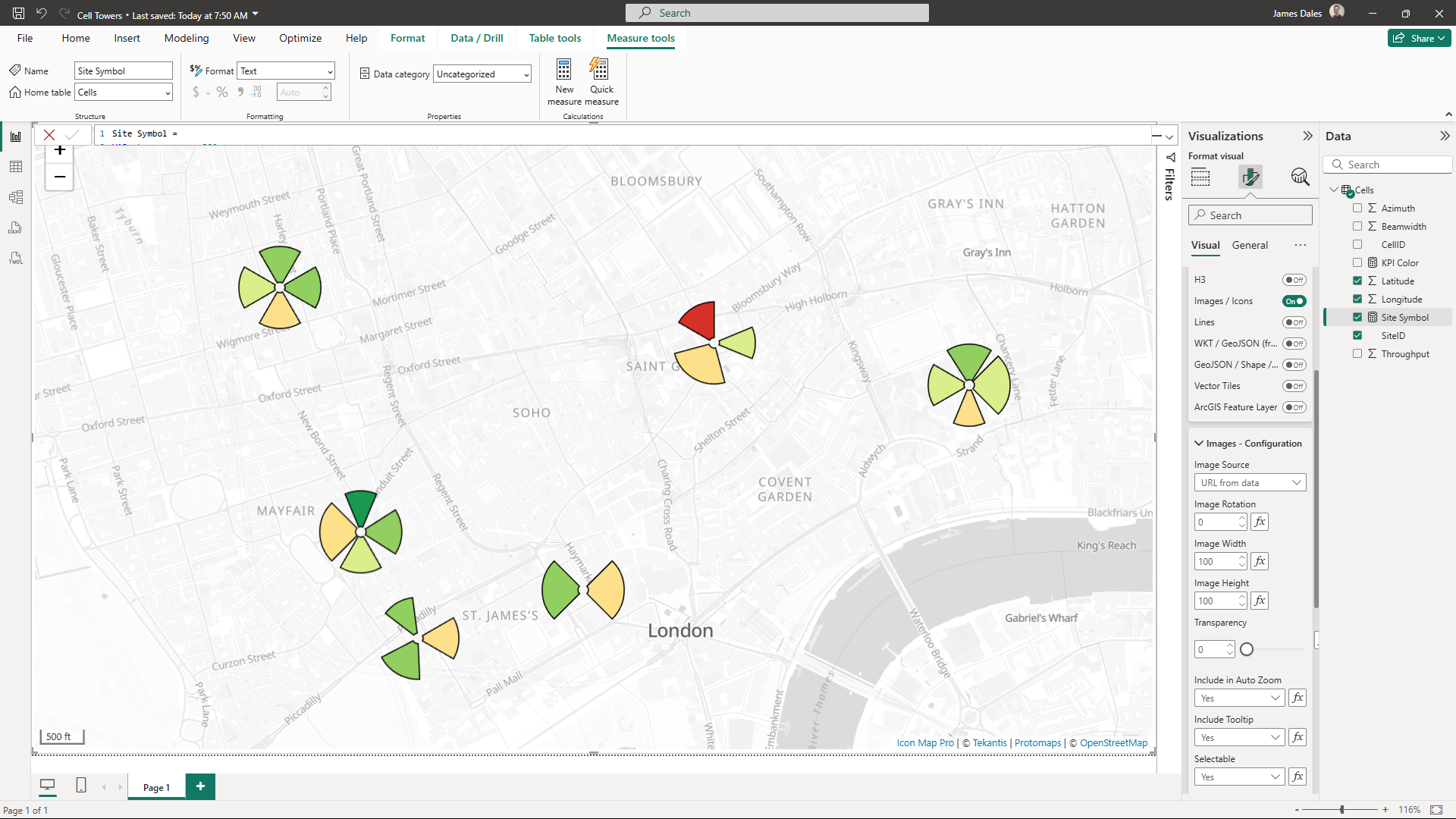
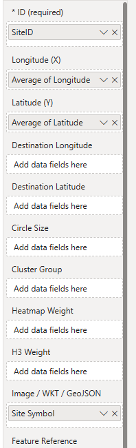
The data configuration is straightforward. The ID field in Icon Map Pro should represent the granularity of each item we want on the map, which in this case is a cell tower site, so add the Site ID to Icon Map Pro's ID field. Then drag in the longitude and latitude. Ensure the aggregation type is Average. This will make sure the longitude and latitude stays the same for each site. Then drag our new Site Symbol measure to the Image / WKT field:

Icon Map Pro field configuration

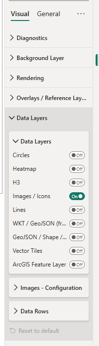
The final step is to turn on the Image Data Layer in Icon Map Pro's settings:

Icon Map Pro Settings configuration

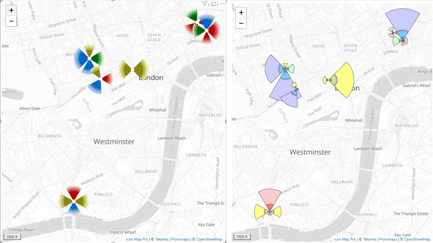
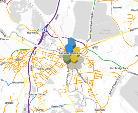
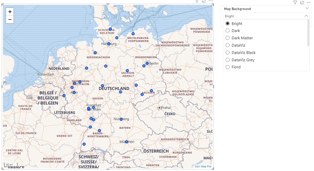
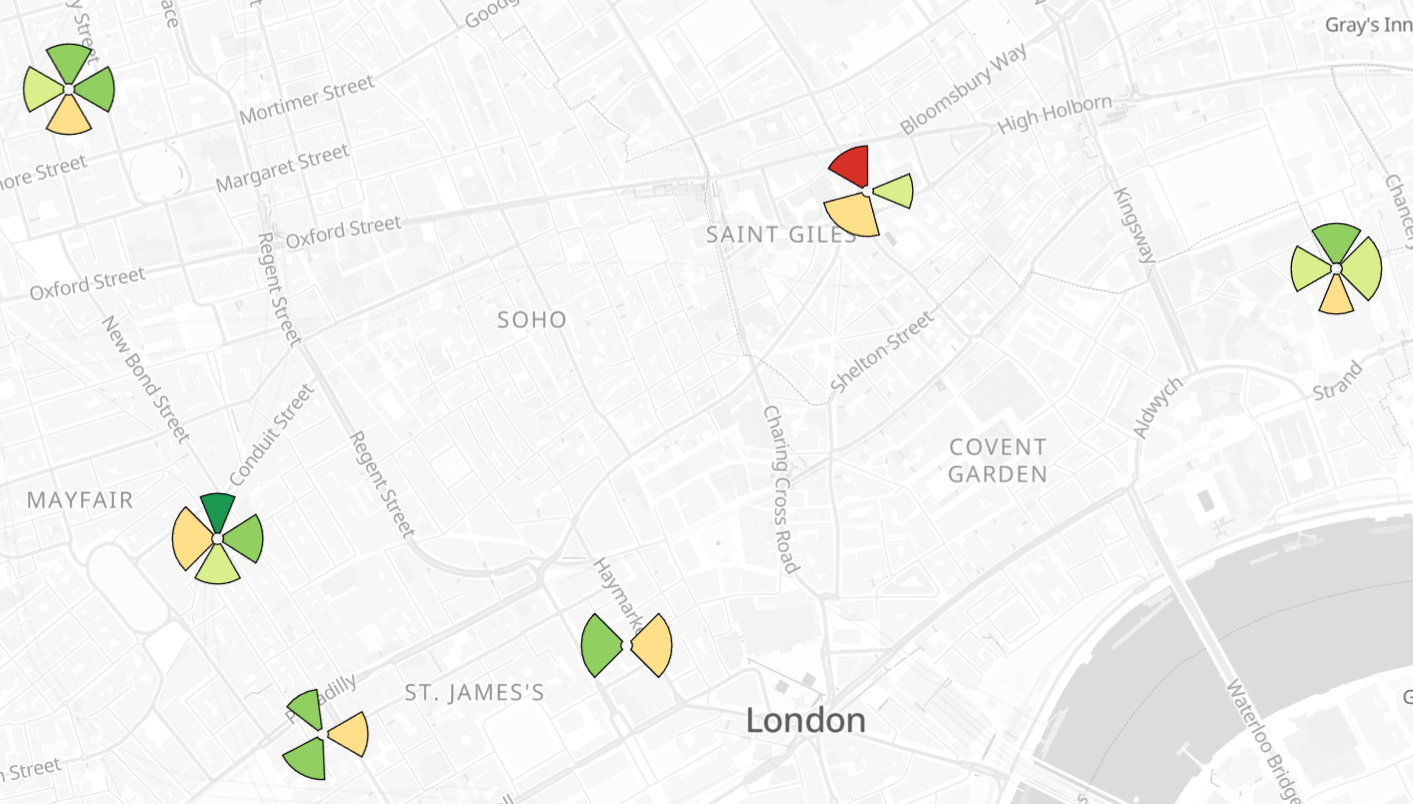
Your map should now look like this:

Resulting Map

You can download the .pbix file to see this in action.

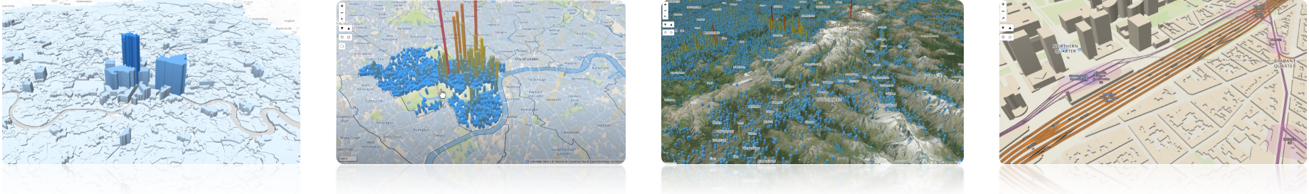
These same functions can be used to draw more complicated diagrams by varying the min and max radius settings:

More complicated examples

Filtering Reference Layers

· 3 min read
James Dales
Co-founder of Tekantis

Icon Map Pro provides the ability to show reference layers on the map. These reference layers are not connected to the Power BI data, they just additional context to the data layer.

Take this example that shows a map of Welsh local authorities. The circles are a circle data layer, and the local authorities are loaded as a GeoJSON reference layer.

alt text

But what if I had a small sales team where each one was responsible for a small number of local authorities, so you only wanted to show those relevant to that person.

We could change the reference layer to being a GeoJSON data layer, but then we'd need to append the relevant local authorities as additional rows of data, which can then get messy from a data preparation and modelling point of view.

Instead, we can filter the features from the GeoJSON reference layer, and only show those related to each sales person.

I've added a table of data in my model that lists which area each sales person is responsible for:

alt text

The code field corresponds to a field "LAD22CD" in my GeoJSON file, so in the Icon Map Pro settings for the reference layer, I've selected "LAD22CD" in the "Property to Filter" option:

alt text

If there was just one area for each sales person, we could simply assign the "Code" field from our table to the "Filter Value" setting using the fx button. However, as we have multiple areas per person, we will need to create a DAX measure to generate a concatenated list of areas:

Codes = CONCATENATEX('wales_areas json', "'" & 'wales_areas json'[Code] & "'", ",")

Now we can assign our Codes measure to the Filter Value setting. Note comma separated lists of values are only supported when WebGL Rendering is enabled in the Icon Map Pro settings:

alt text

I've added the Person Allocation as a slicer so we can pick the sales person, and their territories will be displayed on the map:

alt text

We can even make this more sophisticated by applying Row Level Security and use the USERPRINCIPALNAME() DAX function to automatically filter to the logged in user. I wouldn't recommend this as a security mechanism, but as a way to automate the filtering.

You can download the Power BI file to see this in action.

Drilling Down Through Pre-Calculated H3 Hexagons

· 2 min read
James Dales
Co-founder of Tekantis

H3 Hexagons provide a great mechanism for aggregating large volumes of point data. By grouping individual events into consistent hexagonal cells at different resolutions, analysts can quickly move between high-level overviews and detailed, street-level insights. This flexibility is especially powerful in spatial analysis tasks, such as exploring patterns of road traffic accidents, where drilling down from broad regional trends to local hotspots helps uncover both strategic and tactical insights. In this post, we’ll walk through how to enable Power BI drill-down using H3 cells, showing how accident data can be explored seamlessly across multiple spatial resolutions.

alt text

Whilst Icon Map Pro can generate H3 hexagons based on longitude and latitude values provided to the visual, this blog focuses on scenarios where we have already pre-calculated the H3 cells before loading into Power BI.

Taking the road traffic accident example further, each row in my dataset represents a single accident that has occurred in Surrey in the UK. For each of these accidents, we have pre-calculated the H3 cell ID in a number of resolutions:

alt text

When we have pre-calculated H3 indexes we must assign them to the ID field in Icon Map Pro. To enable drill-down, we can drag all of the H3 fields at increasing resolutions into the ID field well:

alt text

And then for the H3 weight, I'm using the number of accidents as a simple count:

alt text

This is all the data we need to provide to Icon Map Pro to enable drill-down H3 hexagons.

To configure the layer we tell Icon Map Pro that our H3 indexes are pre-calculated as hex references:

alt text

And set up the formatting:

alt text

Then we can can start at a low resolution:

alt text

Then use the double drilldown arrow to view all items in more detail:

alt text

Or the single drill-down arrow to drill into a specific accident hotspot:

alt text

You can download the Power BI report used in this example to explore how it was created.

How to provide the ability for your users to select a background map

· 2 min read
James Dales
Co-founder of Tekantis

Icon Map Pro comes with a range of available background styles included. Sometimes you may want to provide the ability for the end-users of your report to select the style themselves.

Icon Map Pro doesn't yet include a menu as part of the user interface, but we can use a slicer visual in Power BI to provide the selection, and pass the selected style through to Icon Map Pro.

alt text

You'll notice that the Icon Map Pro style dropdown doesn't have a conditional formatting "fx" button so we can't assign the selected style here. Instead we need to change the Map Source to be "Vector Tiles" and use the "fx" button against "URL of the style JSON file".

alt text

Whilst we could manually provide a list of URLs, we can use Icon Map Pro's styles API and request the available styles and their associated URLs from https://styles.iconmappro.com/styles/styles.json

This is a JSON file that we can load into a table in our Power BI report. If you filter the results to include only those of type "background" then these should all work as background maps. You may also wish to filter out those with "(GB only)" in the name if your data extends beyond Great Britain.

alt text

Once loaded in, we can simply assign the styles.name field to a slicer. I recommend setting the slicer to be "Single select".

Then in the Icon Map Pro Vector Tiles URL setting, we can assign the styles.url field.

The background style selection will now be based on the selected item in the slicer.

You can download a sample Power BI file to see this in action.

Icon Map Slicer - What is it, and why?

· 5 min read
James Dales
Co-founder of Tekantis

Last week we released Icon Map Slicer. Knowing this would raise some questions, I thought I’d address them up front in a blog post.

What is Icon Map Slicer?

Icon Map Slicer Screenshots

Put simply, Icon Map Pro is a display visual—just like a bar chart in Power BI is a display visual—whereas Icon Map Slicer is a slicer visual. Many of our Icon Map Pro customers (and potential customers) asked for the ability to select items on the map in ways that Icon Map Pro can’t.

For example:

  • Keeping map selections active while interacting with other visuals on the page.
  • Persisting selections across different report pages.
  • Selecting hundreds (or even thousands) of items on the map.
  • Selecting all items contained within another item.

Icon Map Slicer addresses these needs, offering powerful new ways to select data:

  • Selections persist automatically.
  • Works with Power BI’s Sync Slicers capability to mirror selections across pages.
  • Uses a more efficient Power BI API to filter data, allowing large selections without causing Power BI to “hang.”
  • Select all items within polygons from reference layers (e.g. all care providers within a council area).
  • Select all items within or intersecting with other items (e.g. protected woodland intersecting a proposed railway line).
  • Use a circle radius tool or a lasso to select data (e.g. all competitors within 2 km of a store).
  • Filter data by the current map view—zoom or pan the map, and other visuals in the report update to reflect the visible extent.

In addition to these selection options, Icon Map Slicer can display a wide range of data items, including:

  • Circles
  • Images and Icons
  • 3D Columns
  • H3 Hexagons
  • Interactive, conditionally formatted GeoJSON and Shapefiles
  • Geometry stored in WKT and GeoJSON feature formats
  • Lines

Some items can also be displayed in 3D by providing a height value. The background map can include 3D terrain, and the map itself can be rotated and tilted.

Why is it a different visual?

So why release a separate visual instead of adding these features into Icon Map Pro? The short answer: the Power BI visuals SDK doesn’t allow a single visual to operate as both a slicer and a display visual. When creating a visual, you must specify in the configuration whether it’s one or the other.

This is actually our third iteration at building this visual—the first two never made it into public preview. Initially, we aimed to enable slicer functionality directly within Icon Map Pro. But we quickly realised the extensive changes required (particularly in how items are identified for selection and cross-highlighting) would have created messy, unmaintainable code.

Splitting the codebase allowed us to:

  • Build a cleaner, dedicated slicer visual.
  • Base the visual on the MapLibre mapping library (instead of Leaflet), unlocking rotation, tilt, and 3D terrain/object support.

How else does it differ from Icon Map Pro?

Building a Power BI map visual means taking into account both technical constraints and licensing rules from third-party providers. For instance, Google Satellite imagery cannot legally be used with non-Google mapping libraries like MapLibre—a shame, because it looks stunning with 3D terrain!

As mentioned, Icon Map Slicer is built entirely on MapLibre. In contrast, Icon Map Pro uses Leaflet, with an option to piggyback MapLibre when “WebGL Rendering” is enabled. This mode offers some performance benefits but remains limited by Leaflet’s constraints (e.g. stepped zoom, no tilt/rotation). However, Leaflet’s wide ecosystem of plugins and integrations gives Icon Map Pro capabilities that aren't available in Icon Map Slicer.

Here are the current key differences:

Map Interactivity

Feature / CapabilityIcon Map ProIcon Map Slicer
Gradual Map Zoom
Stepped Map Zoom
Tilt and Rotate Map
Power BI Tooltips
Drill-down
Drill-through

Selection

Feature / CapabilityIcon Map ProIcon Map Slicer
Cross-filter other visuals
Cross-filtering from visuals
Cross-highlight other visuals
Cross-highlighting from visuals
Efficient selection (100s items)
Lasso tool
Circle radius selection
Select within reference polygon
Select intersecting items
Filter by map extent

Background Mapping

Feature / CapabilityIcon Map ProIcon Map Slicer
3D Terrain
Tekantis Map Styles
Ordnance Survey Open Zoomstack
Google Maps Integration
Azure Maps Integration
ArcGIS Online Integration
Mapbox Integration
Mappable Integration
MapTiler Integration
Ordnance Survey Premium Integration

Reference Layers

Feature / CapabilityIcon Map ProIcon Map Slicer
Place names (Tekantis / OS)
Place names (Azure / ArcGIS/ Mapbox)
Realtime Daylight Terminator
DateTime field Daylight Terminator
ArcGIS Feature Layers
Realtime Traffic
Realtime Weather
WMS Support
GeoJSON / Shapefiles
Raster Tiles
Styled Vector Tiles

Data Layers

Feature / CapabilityIcon Map ProIcon Map Slicer
Circles
Clustering
3D Columns
Images / Icons
Heatmaps
H3 Hexagons
GeoJSON / Shape Files
Vector Tiles
Shapes in WKT / GeoJSON
ArcGIS Feature Layers
Lines
Lines (flows)PlannedComing soon

If I already have Icon Map Pro, do I have to pay more for Icon Map Slicer?

Icon Map Slicer is a separate product, so it isn’t included in your Icon Map Pro subscription. However, if you already hold an Icon Map Pro annual subscription for 25+ users, we’re pleased to offer Icon Map Slicer at a substantial discount. Please contact sales@iconmappro.com for details.

Is Icon Map Pro still being developed?

Absolutely. Both Icon Map Pro and Icon Map Slicer are being actively developed in parallel. Where possible, we’ll release features in both, though not always at the same time.

  • Slicer specific features will remain unique to Icon Map Slicer.
  • Icon Map Pro will eventually gain tilt, rotation, and 3D terrain.
  • Some Pro features (like WMS layers and heatmaps) are planned for the Slicer.

Are you planning more visuals?

We don’t currently plan to release new visuals, but we are working on powerful, new geospatial capabilities for Power BI and Microsoft Fabric. These will benefit both Icon Map Pro and Icon Map Slicer—stay tuned for updates in the coming months!